
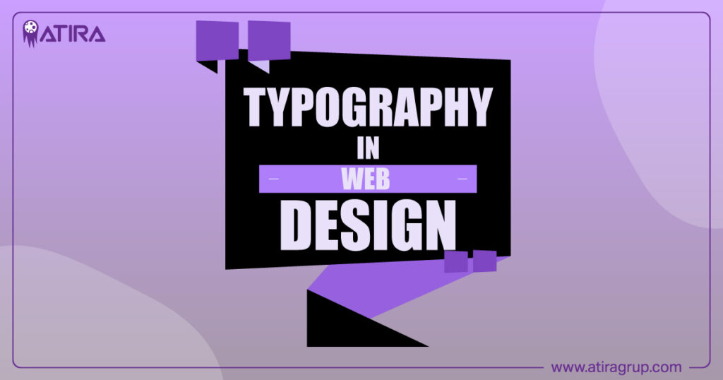
Typography in web design is crucial for creating an engaging user experience. It determines readability, aesthetics, and user interaction. This article will provide you with practical tips for selecting fonts, improving readability, and optimizing your typography for all devices.
Key Takeaways
- Typography is essential in web design for readability and user engagement, adapting to various screens and devices.
- Key elements like font choice, line spacing, and color contrast significantly impact user experience and brand perception.
- Best practices, such as limiting the number of fonts and optimizing for accessibility, enhance readability and overall website performance.
Table of Contents
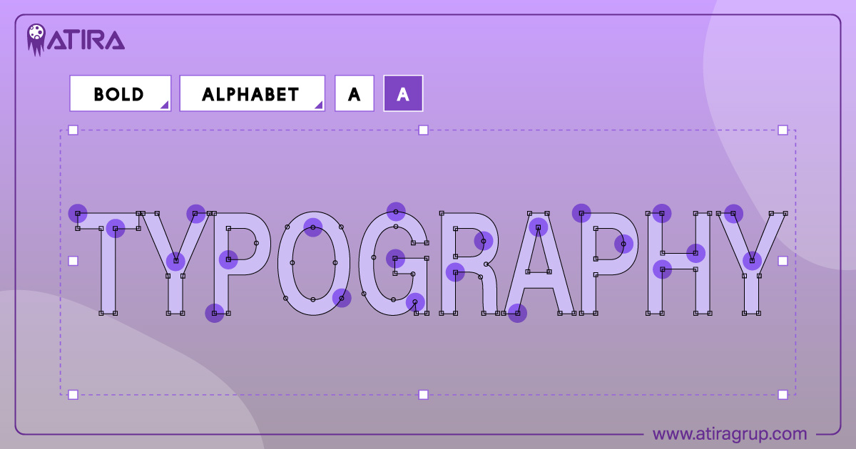
Understanding Typography in Web Design
Typography is a cornerstone of web design. It encompasses the selection and arrangement of fonts, spacing, and layout to create readable and aesthetically pleasing text on a screen. Unlike print typography, web typography must adapt to various screen sizes and devices, making it a dynamic and challenging aspect of web design.
Definition of Typography in Web Design
Typography in web design refers to the use of typefaces, fonts, spacing, and layout to enhance readability and aesthetics. It involves selecting appropriate typefaces and fonts, designing text layouts, and modifying font styles to fit the digital medium.
Unlike printed text, web typography must be flexible to adapt to different screen dimensions and user interactions, ensuring a seamless experience across devices.
Importance of Typography
Effective typography is crucial for creating visually appealing and user-friendly websites. It enhances engagement by making content easier to navigate and interact with. Good typography can significantly influence how users perceive a brand, contributing to a memorable identity and positive user experience. Moreover, ensuring readability and accessibility through carefully chosen typefaces and layouts helps all users engage with your content effectively.
Typography isn’t just about aesthetics; it plays a vital role in communication. Well-structured typography guides readers through the content, emphasizing important information and creating a logical flow. This not only improves comprehension but also keeps users on your site longer, enhancing overall engagement.
In essence, typography is a powerful tool that web designers can use to create a more impactful and enjoyable user experience.
Key Elements of Web Typography
Typography in web design is a symphony of various elements working together to create intuitive and delightful interactions. The main elements web designers need to focus on include typefaces, fonts, whitespaces, color, and contrast.
These elements are the building blocks of effective web typography, each playing a unique role in enhancing visual communication.
Fonts and Typefaces
A typeface is a collection of fonts, while a font refers to a specific style of a typeface, such as weight and size. Typography plays a critical role in web design by influencing not only the layout and user experience but also accessibility. Choosing legible typefaces enhances readability and helps in establishing a strong brand identity. Standard fonts are preferred because users are accustomed to them, which increases scanning speed and comprehension.
Fonts and typefaces are the heart of web typography. They set the tone and mood of your content, influencing how users perceive your brand. Legible fonts are essential for readability, and selecting the right typefaces and font weights can make your website more inviting and engaging.
It’s important to balance aesthetics with functionality to create a seamless user experience.
Line Spacing and Letter Spacing
Line spacing, also known as leading, refers to the vertical spacing between lines of text. Proper line height, typically around 1.5 times the font size, is crucial for readability, helping users follow along a line of text more easily.
Letter spacing, or tracking, refers to the overall spacing between letters in a block of text. Adjusting letter spacing can either create a more spacious effect or make content appear denser, impacting legibility.
Font Sizes and Hierarchy
Establishing a clear typographic hierarchy helps users navigate content more efficiently. Header tags like <h1> and <h2> are commonly used to create this visual hierarchy, with headings being larger than body text. Different fonts should be designated for body text and headings to emphasize the hierarchy, guiding users’ attention and making the content easier to digest.
Choosing the Right Fonts for Your Website
Choosing the right fonts is a critical step in web design. The typeface should align with the tone and purpose of your project, influencing the emotional response of the audience. A balance of readability and aesthetics can be achieved by using serif and sans-serif fonts for contrast.
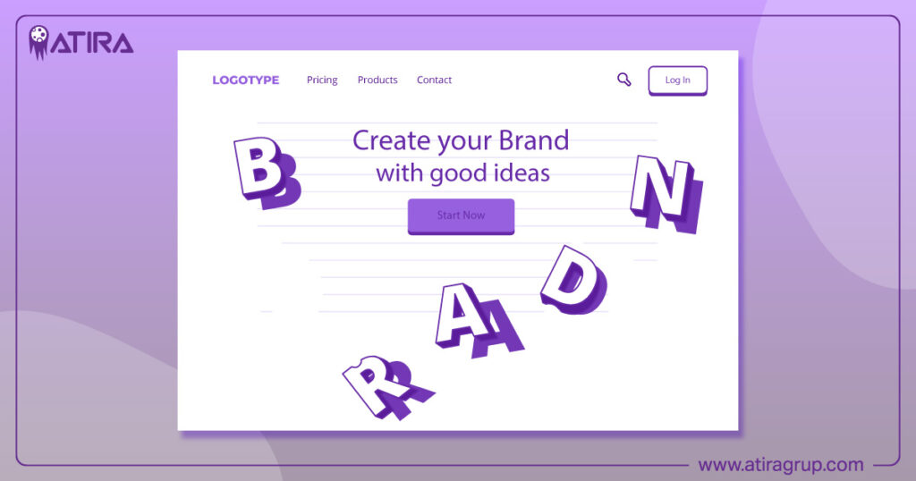
Following a systematic approach to font selection can simplify this process and ensure a cohesive design.
Sans Serif vs. Serif Fonts
In typography, fonts are categorized primarily into two styles: serif and sans serif. Sans serif fonts, characterized by clean lines and minimalistic design, are suitable for digital screens. On the other hand, serif fonts have small lines or extensions at the ends of their strokes, providing a traditional look and enhancing readability in print. A popular choice for modern designs is the sans serif font, particularly among those who prefer sans serifs for their simplicity.
When choosing between these styles, consider the context and purpose of your text.
Monospaced Fonts
Monospaced fonts are typefaces where each character occupies the same width, making them distinct from proportional fonts. They are primarily used in coding environments and tech-related sites to improve clarity and readability.
Monospaced typefaces maintain the proper alignment of text, which is crucial for displaying code and tabular data effectively.
Font Pairing Techniques
Pairing fonts is an art that can add visual interest and hierarchy to your website. It’s advantageous to choose typefaces that complement each other while providing distinct visual separation.
Using contrasting font styles can create visual interest and help guide the viewer’s attention. Ensuring that different fonts are used consistently across the site for different types of text is key to maintaining harmony.
Best Practices for Effective Web Typography
To achieve effective web typography, certain best practices should be followed. Choosing legible typefaces, limiting fonts, and ensuring appropriate size and contrast are essential. Following these guidelines ensures that your designs meet user expectations and keep them engaged with your content.
Learning from industry best practices will provide tips and tricks for creating excellent typography.
Limit the Number of Fonts
Using only one or two typefaces can foster a unified look and feel in a design project. A website should have no more than three font families or typefaces to ensure effective design. Using too many fonts can make a website look cluttered and unprofessional, creating stress for users and reducing responsiveness.
Appropriate Font Size and Scaling
The recommended font sizes for web design are as follows:
- Headings: between 24px to 48px
- Body text: a minimum of 16px for readability
- Desktop content: typically ranges from 16-20pt
- Mobile devices: typically ranges from 12-16pt
Using appropriate font sizes improves readability across devices, enhancing the user experience.
Heading sizes should scale down for mobile typography to ensure they remain legible on smaller screens.
Use of Color and Contrast
Color plays a significant role in typography, fitting the background and brand aesthetic. Balancing color and saturation is essential for a clean look. Contrast in typography can be created through the use of distinct fonts, changing font weight, adjusting text spacing, or altering font and background colors.
Ensuring sufficient color contrast is critical for enhancing accessibility and making content more readable for all users.
Enhancing Readability and Accessibility
Effective web typography enhances user engagement by improving the readability of content.

Here are some crucial factors for maximizing readability in body text:
- Moderate font size
- High color contrast
- Appropriate line length
- Adequate spacing
Choosing easy-to-read fonts and effective use of whitespace can enhance accessibility.
Web-safe fonts ensure that visitors can read content easily on various devices. Using relative font sizes allows ease in scaling fonts based on screens and browser settings.
Designing for Screen Readers
Using semantic markup is essential as it provides structure that assists screen readers in interpreting content. This ensures that all users, including those relying on screen readers, can access and navigate your content effectively.
Ensuring Sufficient Contrast
According to WCAG, at least a 4.5:1 contrast ratio is recommended for body text, while larger, bolded text should have at least a 3:1 ratio. Ensuring sufficient contrast between text and background is essential for accessibility as it enhances legibility for all users.
Common color pairing mistakes in web design, such as using yellow on white or navy on black, can significantly decrease readability.
Avoiding All Caps Text
Using all capital letters in text can hinder the ability to recognize words quickly, impacting overall readability. All caps text can create a barrier to quick reading and comprehension, frustrating users and leading to a negative user experience.
Web designers should avoid using all caps for body text to enhance readability and ensure a better user experience.
Optimizing Web Fonts for Performance
Optimizing web fonts is crucial to prevent negative impacts on website performance. Each font file adds to page load time, impacting overall performance. Using preload directives can help the browser discover and load web fonts sooner during page load.

Inlining @font-face declarations in the HTML head can also make web fonts discoverable earlier than relying on external stylesheets.
Using Web-Safe Fonts
Web-safe fonts ensure that visitors can easily read content on various devices. A list of backup fonts in CSS for rendering alternatives is referred to as a font stack.
Utilizing a font stack in CSS is essential for providing alternatives if a preferred font is unavailable.
Font File Optimization
Larger font files take longer to load and increase data download for users. Removing unnecessary glyphs through font subsetting can significantly lower font file sizes and improve load times.
Tools like Google PageSpeed Insights can effectively measure the performance impact of font files.
Cross-Platform Consistency
Thorough testing ensures consistent typography across platforms. Iteration plays a crucial role in this process. Fonts may look different on various devices, causing legibility issues. Designers can manage cross-platform rendering issues by using fonts designed for digital screens and CSS properties for fine-tuning.
Testing and Refining Your Typography
Evaluating typography choices through testing is essential for enhancing user interaction and satisfaction. Testing typography choices is crucial to ensure they meet user needs and enhance the overall user experience.
User Testing Methods
The main purpose of user testing is to gather insights into readability and user experience. User testing in typography focuses on understanding how real users interact with text on websites.
Iterative Design Process
The iterative design process for typography involves making gradual improvements based on user feedback and testing. Continuous improvements based on user feedback allow designers to create more effective typography that aligns with user expectations and enhances usability.
Summary
Mastering typography in web design is a journey that involves understanding its fundamental elements, choosing the right fonts, and applying best practices to enhance readability and accessibility. By optimizing web fonts for performance and continuously refining your typographic choices through testing, you can create a visually appealing and user-friendly website. Remember, good typography not only improves user experience but also strengthens your brand identity. Keep experimenting, testing, and refining to achieve the perfect balance of aesthetics and functionality in your web design.
Related articles:
What You Need to Know About User Experience Design
Mastering Corporate Identity: Key Elements and Practical Examples
Frequently Asked Questions
Why is typography important in web design?
Typography is important in web design because it directly affects how users interact with content and influences readability. When done well, it enhances the visual appeal and ensures your message is easily understood.
How many fonts should I use on my website?
Stick to a maximum of three font families on your website for a clean and professional look. Too many fonts can create a cluttered and unappealing design.
What is the difference between serif and sans serif fonts?
The main difference is that serif fonts have decorative strokes at the ends of letters, giving them a classic vibe, while sans serif fonts are smooth and modern, making them great for screens. So, if you want a timeless look, go for serif; if you prefer a clean, contemporary feel, choose sans serif.
How can I ensure my typography is accessible?
To make your typography accessible, opt for moderate font sizes, ensure high color contrast, and maintain proper line length and spacing. Also, remember to design with screen readers in mind and steer clear of using all caps for body text.
What are web-safe fonts?
Web-safe fonts are the ones that guarantee your content looks good and is easy to read on any device. By using a font stack in CSS, you can ensure that if one font isn’t available, there are backup options for a consistent viewing experience.