
Hierarchy in web design guides users to the most important information swiftly. It ensures websites are organized and intuitive.
This article will cover the essential principles and practices to apply visual hierarchy effectively, enhancing user experience.
Key Takeaways
- Visual hierarchy organizes design elements by importance, enhancing user experience and reducing cognitive load.
- Key principles of visual hierarchy include size and scale, color and contrast, and alignment and spacing, which together improve navigation and readability.
- Consistency across multiple pages and responsive design are crucial for maintaining a coherent visual hierarchy, ensuring usability across different devices.
Table of Contents
Understanding Visual Hierarchy in Web Design
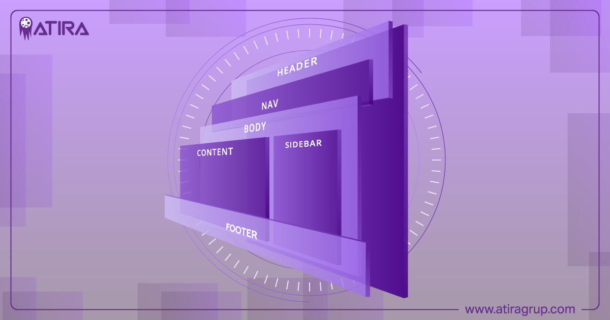
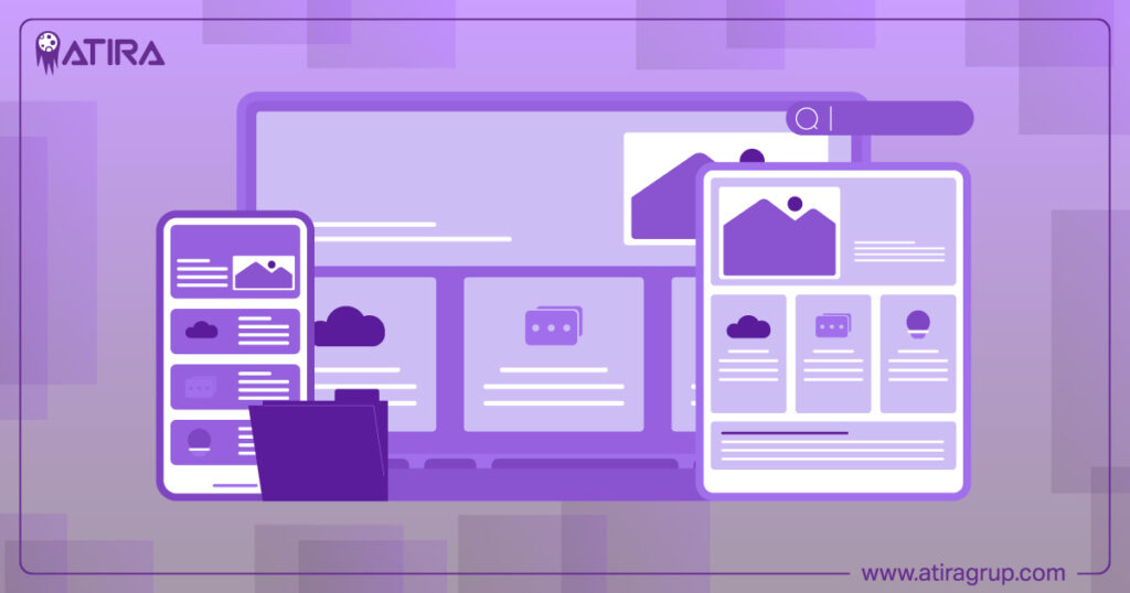
Visual hierarchy is the backbone of effective web design. It organizes design elements based on their significance, ensuring users can easily find and interact with the most critical information first. Think of it as a roadmap that guides users to create hierarchy through a structured journey, reducing confusion and enhancing overall usability.
A clear visual hierarchy decreases cognitive load, allowing users to process information swiftly and efficiently. When web designers strategically place elements, they create a layout that is not only aesthetically pleasing but also functional. This organization makes content easy to scan, helping users locate what they need without feeling overwhelmed.
Visual cues play a significant role in this process. Highlighting important elements directs user attention to where it’s needed most, enhancing the website’s layout effectiveness. This approach communicates desired messages effectively and supports the user journey, keeping visitors engaged and encouraging exploration, emphasizing visual importance.
In essence, a solid visual hierarchy is pivotal for an engaging user experience. It keeps users on the page longer, helps them achieve their goals more easily, and ensures they have a positive experience with your site. Exploring the principles and practices of conclusion visual hierarchy reveals how these concepts come to life in web design.
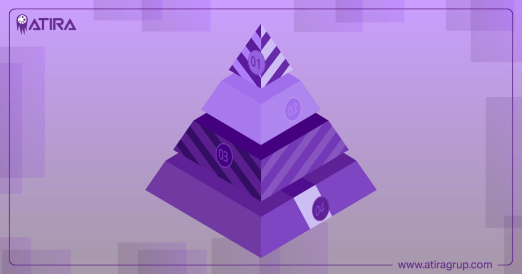
Key Principles of Visual Hierarchy
Effective visual hierarchy is built on several key principles that work together to draw attention to important elements and improve user experience. These principles include size and scale, color and contrast, and alignment and spacing. Understanding and applying these principles allows web designers to create layouts that are both visually appealing and highly functional.
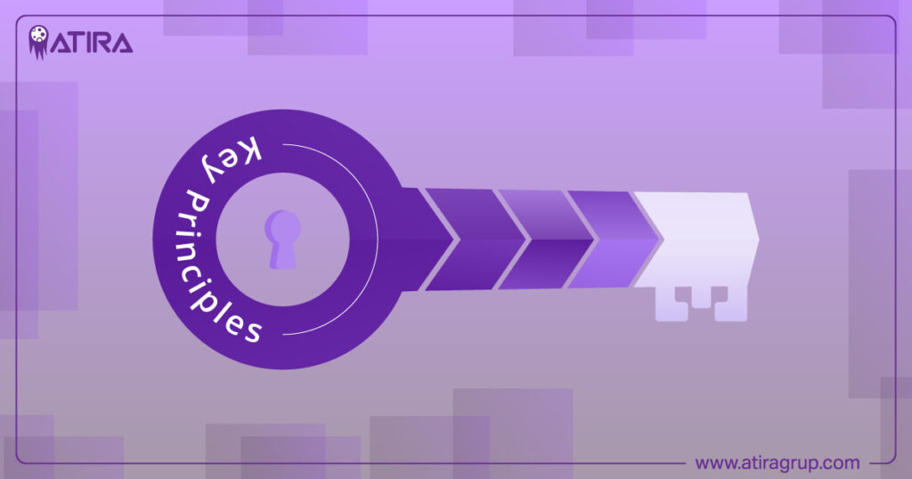
Each principle contributes uniquely to the overall hierarchy. Size and scale dictate the prominence of elements, color and contrast enhance visual interest and highlight key information, and alignment and spacing organize content for better readability.
Let’s explore each of these principles in more detail.
Size and Scale
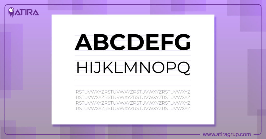
Size and scale are fundamental to creating focal points in your design. Larger elements naturally attract more attention, highlighting crucial information and guiding the viewer’s focus. For instance, a well-constructed blog title often appears in a larger font size than the main content, signaling its importance.
However, balance is key. Overemphasizing all the elements by making them the same size can overwhelm users, making the design ineffective. Instead, use varying sizes to create a clear hierarchy. A well-designed poster, for instance, might feature a large, bold title as the main focal point, with smaller text providing supplementary information.
Carefully considering the size and scale of each web elements enables web designers to create a visually appealing layout that effectively communicates the importance of different pieces of content in web designing. This method enhances usability and improves the overall aesthetic of the web page.
Color and Contrast
Color and contrast are powerful tools in establishing a clear visual hierarchy. Bright colors and high contrast can draw attention to focal points, making them stand out against the background. For example, using contrasting colors for call-to-action buttons can make them more noticeable, encouraging users to take desired actions.
Effective use of color involves more than just bright hues. Warm and cool elements can be used to create depth and guide the user’s eye through the content. Saturation levels also play a role; bright, saturated colors draw more attention compared to muted tones. This selective use of color helps maintain its impact and ensures that critical information stands out.
Contrast, whether through differences in color, size, or value, is essential in creating a visual hierarchy. It helps to distinguish between different elements, enhancing the overall visual appeal and guiding the user through the content. Carefully selecting and combining colors allows designers to create a visually engaging and effective web design.
Alignment and Spacing
Alignment and spacing are critical for creating an organized and visually pleasing layout. Proper alignment ensures that elements are visually connected, making the design easier to navigate. For example, aligning text and images consistently helps users follow the content more naturally.
Negative space, or white space, plays a significant role in enhancing clarity and readability. It prevents clutter, allowing important elements to stand out more effectively. This use of white space can make a design appear cleaner and more professional, improving overall user experience.
Combining alignment with appropriate spacing allows designers to create a balanced layout that is both functional and aesthetically pleasing. This careful arranging elements helps maintain a clear visual hierarchy, guiding users effortlessly through the content.
Reading Patterns: F and Z
Understanding common reading patterns is crucial for optimizing web design. The F-pattern and Z-pattern are two primary ways users scan web pages, influenced by cultural reading habits. The F-pattern involves scanning the top horizontally, then moving down the left side, making it ideal for text-heavy designs.
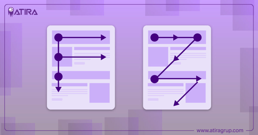
In contrast, the Z-pattern starts at the top left, moves to the top right, diagonally down to the bottom left, and finally to the bottom right. This pattern is effective for minimal designs with fewer elements. Strategically placing calls to action along these paths enhances user engagement and ensures important elements are noticed.
Typographic Hierarchy
Typography plays a crucial role in creating a clear visual hierarchy. Organizing text elements through varied font sizes, weights, and styles guides the reader’s attention and highlights important information. Using HTML heading tags (h1 to h6) helps define the importance of each text element, ensuring a logical structure.
Headlines are generally the largest and boldest text, designed to grab initial attention. Subheadings break up content into manageable sections, providing context and making the information easier to navigate. Body text, while smaller, must remain legible to ensure readability.
Contrast in typography can be achieved through size, weight, and color variations, adding visual interest and enhancing the overall hierarchy. Limiting the number of typefaces used helps maintain a cohesive look while still allowing for distinct hierarchies.
Creating Visual Flow
Creating a smooth visual flow is essential for guiding users through the content. Leading lines, whether explicit or implied, play a significant role in directing the viewer’s eye. These lines can be created through the arrangement of elements, such as the gaze of subjects or the direction of objects in the composition.
The rule of thirds is another effective technique, involving dividing the layout into a grid and placing focal points at the intersections. This approach aligns with natural reading patterns and helps create a balanced, visually appealing design.
Using an odd number of objects, known as the rule of odds, can also enhance visual interest and create a more engaging composition. Considering where the viewer’s eyes go initially, second, and finally, creates an intentional and effective visual flow.
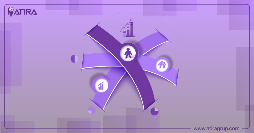
Visual Cues and Indicators
Visual cues and indicators are essential for guiding users through a website. Arrows, symbols, and icons can highlight critical information and direct attention to important elements. For example, arrows can point to call-to-action buttons, making them more noticeable and encouraging user interaction.
Icons represent specific functions and simplify user interaction by conveying information quickly and efficiently. These visual elements enhance usability without overwhelming users with text.
A clear visual flow is established when these design elements are combined thoughtfully, guiding users through the content intuitively and ensuring that particular design element things stand out.
Consistency Across Multiple Pages
Consistency is key to a seamless user experience across multiple pages. Maintaining a consistent design language helps users navigate the site more easily and reduces confusion. Repetition of design elements, such as color schemes, fonts, and button styles, creates a cohesive experience.
Inconsistency can distract users and make the website feel disjointed. Focusing on both aesthetics and functionality ensures that the visual hierarchy is maintained across all web pages, enhancing user engagement and satisfaction.
Coherence among different visual elements within a page or across the website contributes to a unified and professional look, making it easier for users to find and interact with content, ensuring that everyone is on the same page.
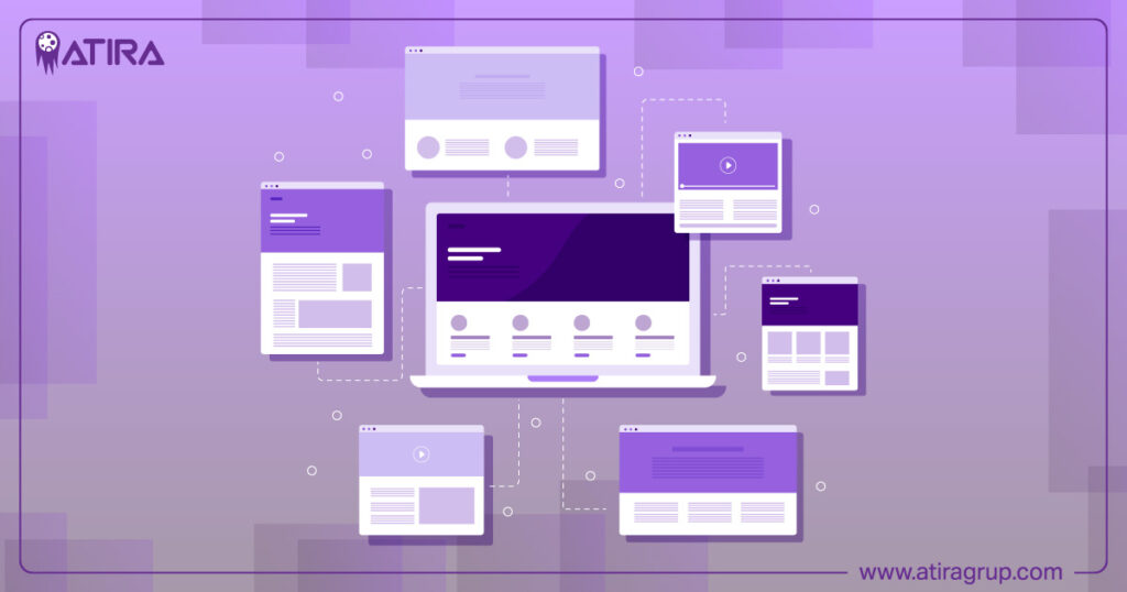
Responsive Design Considerations
Responsive design is crucial for maintaining visual hierarchy across different devices. A mobile-first approach ensures that important elements are noticeable and easily accessible on smaller screens. For older users, a robust desktop experience is essential to ensure usability and comfort.

Correct sizing and spacing of design elements are vital to preserve visual hierarchy on various screen sizes. Techniques like compressing images, lazy loading, and optimizing JavaScript and CSS can improve performance for mobile users, enhancing their experience.
Maintaining the relative size of elements ensures that the visual hierarchy remains effective across all devices, making the website accessible and user-friendly.
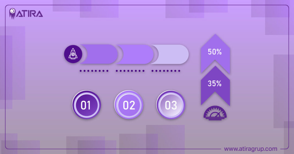
Testing and Iteration
User testing and iterative design improvements are essential for refining visual hierarchy. User testing provides valuable feedback on how users interact with website elements, guiding necessary adjustments. This process can involve modifying color schemes, repositioning elements, and revising content organization to enhance usability.
Iterative design allows for continuous refinement based on user insights and behavior, ensuring that the visual hierarchy is effective and user-friendly. Evaluating user engagement metrics can highlight which design aspects capture attention and drive actions, leading to more informed design decisions.
Implementing these patterns improves website usability and increases user interaction with key content, making the overall design more effective.
Practical Examples of Effective Visual Hierarchy
Practical examples can illustrate how visual hierarchy principles are applied effectively in real-world web designs. Website XYZ uses large headings and contrasting colors to prioritize content, guiding users’ focus. E-commerce site ABC utilizes standout call-to-action buttons to drive user actions and enhance the shopping experience.

Portfolio site DEF organizes visual content in a grid layout, using size and scale to highlight featured works while maintaining coherence. Effective use of white space in these examples avoids clutter and enhances readability, making it easier for users to navigate.
Consistent visual language and typography choices contribute to a clear and organized flow of information, creating a positive user experience.
Summary
Mastering visual hierarchy is essential for creating effective and engaging web designs. By understanding and applying principles such as size and scale, color and contrast, and alignment and spacing, designers can guide users through the content intuitively. Consistency across multiple pages and responsive design considerations ensure that the visual hierarchy remains effective on all devices.
Testing and iteration allow for continuous improvement based on user feedback, leading to more informed design decisions. By implementing these strategies, web designers can create visually appealing and user-friendly websites that captivate and retain their audience.
Top Tips for Mastering Typography in Web Design
What You Need to Know About User Experience Design
Frequently Asked Questions
What is visual hierarchy in web design?
Visual hierarchy in web design arranges elements according to their importance, effectively guiding the user’s attention and improving overall usability. By prioritizing key features, you enhance the user experience on your site.
How does color affect visual hierarchy?
Color significantly impacts visual hierarchy by differentiating information and emphasizing key elements through contrast and saturation, enhancing overall readability.
What are the F-pattern and Z-pattern in web design?
The F-pattern and Z-pattern are essential reading patterns in web design; the F-pattern focuses on scanning the top and left side of content, while the Z-pattern follows a zigzag path across the page. Understanding these patterns can significantly enhance user engagement and readability.
Why is consistency important in web design?
Consistency in web design is crucial as it enhances user experience by providing a cohesive appearance and intuitive navigation, thus reducing confusion for users.
How can user testing improve visual hierarchy?
User testing significantly improves visual hierarchy by offering insights into user interactions, allowing for targeted adjustments that enhance usability and effectiveness. This iterative feedback ensures that design elements are prioritized in a way that aligns with user expectations and enhances overall experience.